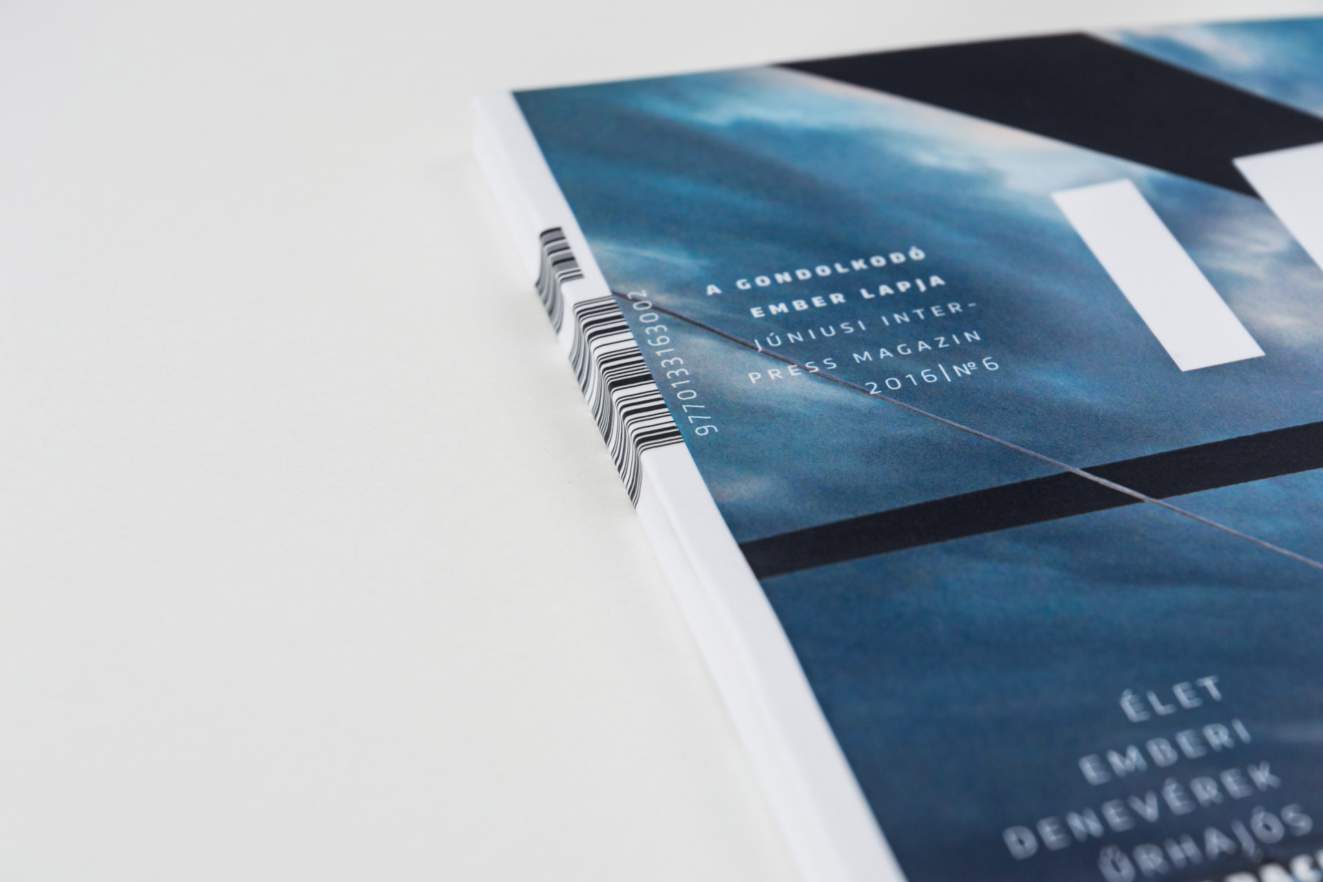
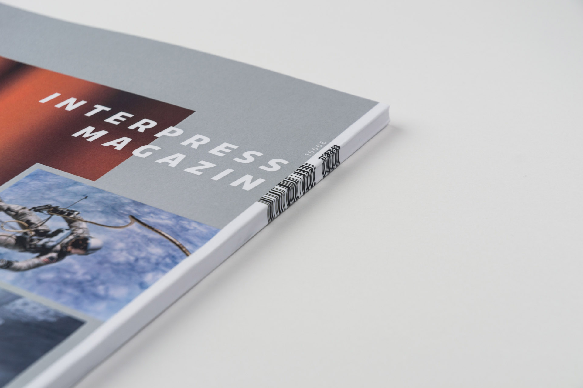
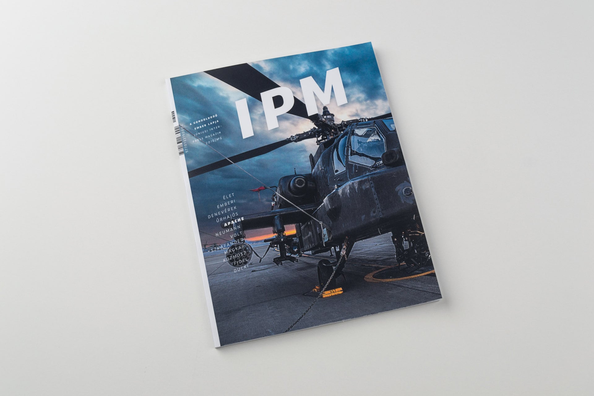
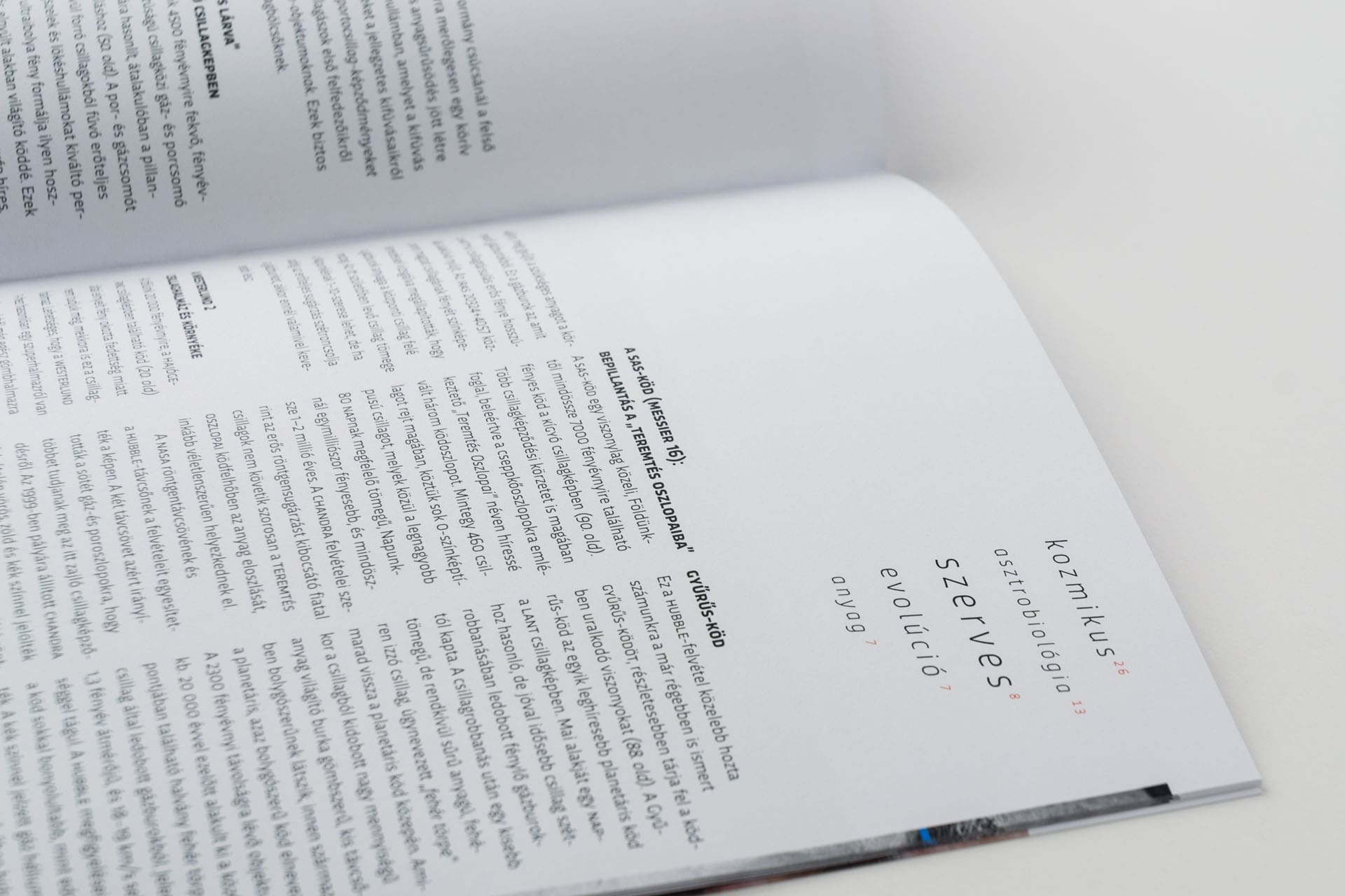
The original reason of launching the magazine in 1975 was to share the freshest foreign news and scientific developments monthly, which later became secondary due to the development of informational society. After having been closed down in 1995 it was born again in 2002, though it only remained a source of interesting, entertaining, colourful articles with a little faded graphics content.
I intended to create a graphically vivid, fresh and entertaining design that is clear and understandable at the same time, and adds to the value of the magazine itself.
IPM redesign
The original reason of launching the magazine in 1975 was to share the freshest foreign news and scientific developments monthly, which later became secondary due to the development of informational society. After having been closed down in 1995 it was born again in 2002, though it only remained a source of interesting, entertaining, colourful articles with a little faded graphics content.
I intended to create a graphically vivid, fresh and entertaining design that is clear and understandable at the same time, and adds to the value of the magazine itself.
Details